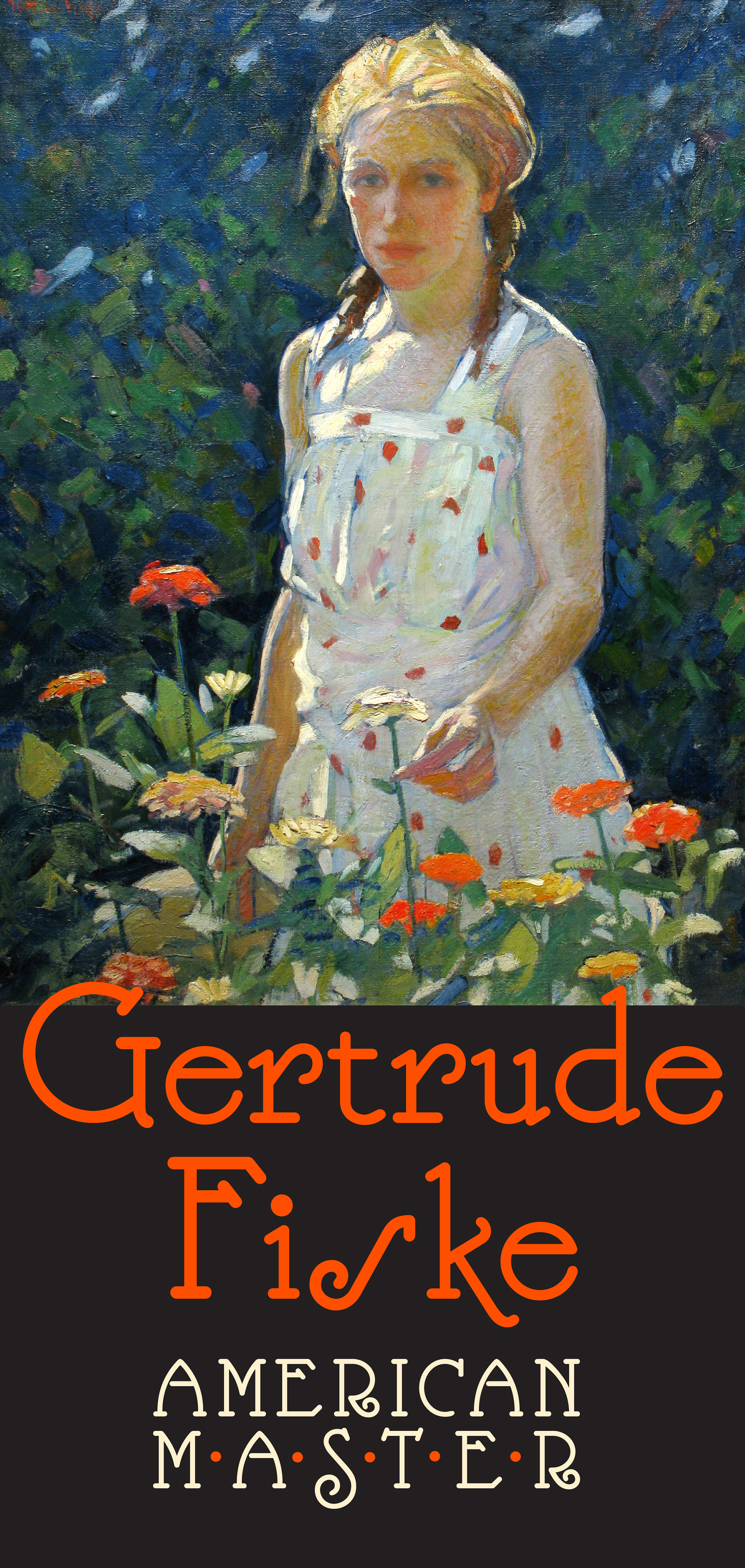
I recently had the pleasure of taking part in the first Gertrude Fiske Symposium held at the Portsmouth Historical Society to discuss the life, work, and societal milieu of Gertrude Fiske (1879-1961) who came from a well-to-do family, studied at the School of the Museum of Fine Arts, Boston for seven years - augmented by summer school with Charles Woodbury in Ogunquit Maine - and then went on to carve a very successful career for herself in the heady days of the early 20th-century. Having completed my presentation, and returned home, it occurred to me that there was so much else I wanted to say about Fiske and her work that I didn't get chance to mention, so here are a few thoughts that I would like to share with a wider audience.
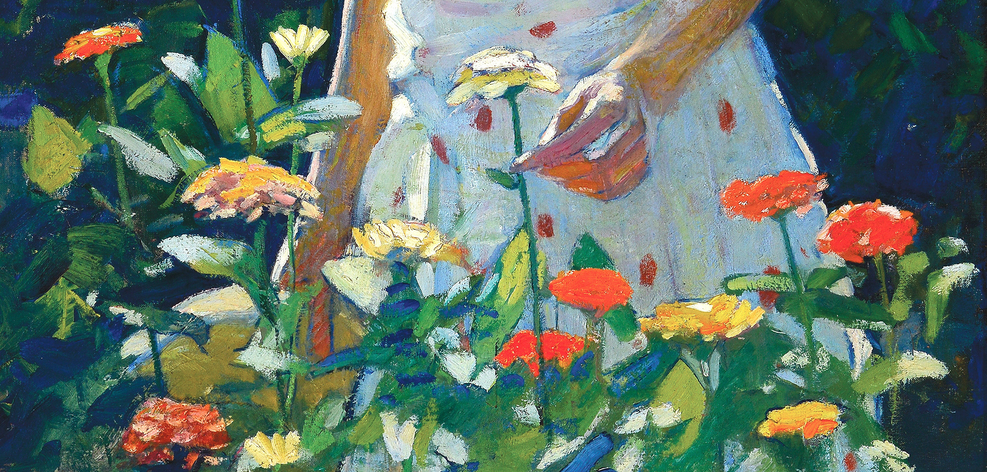
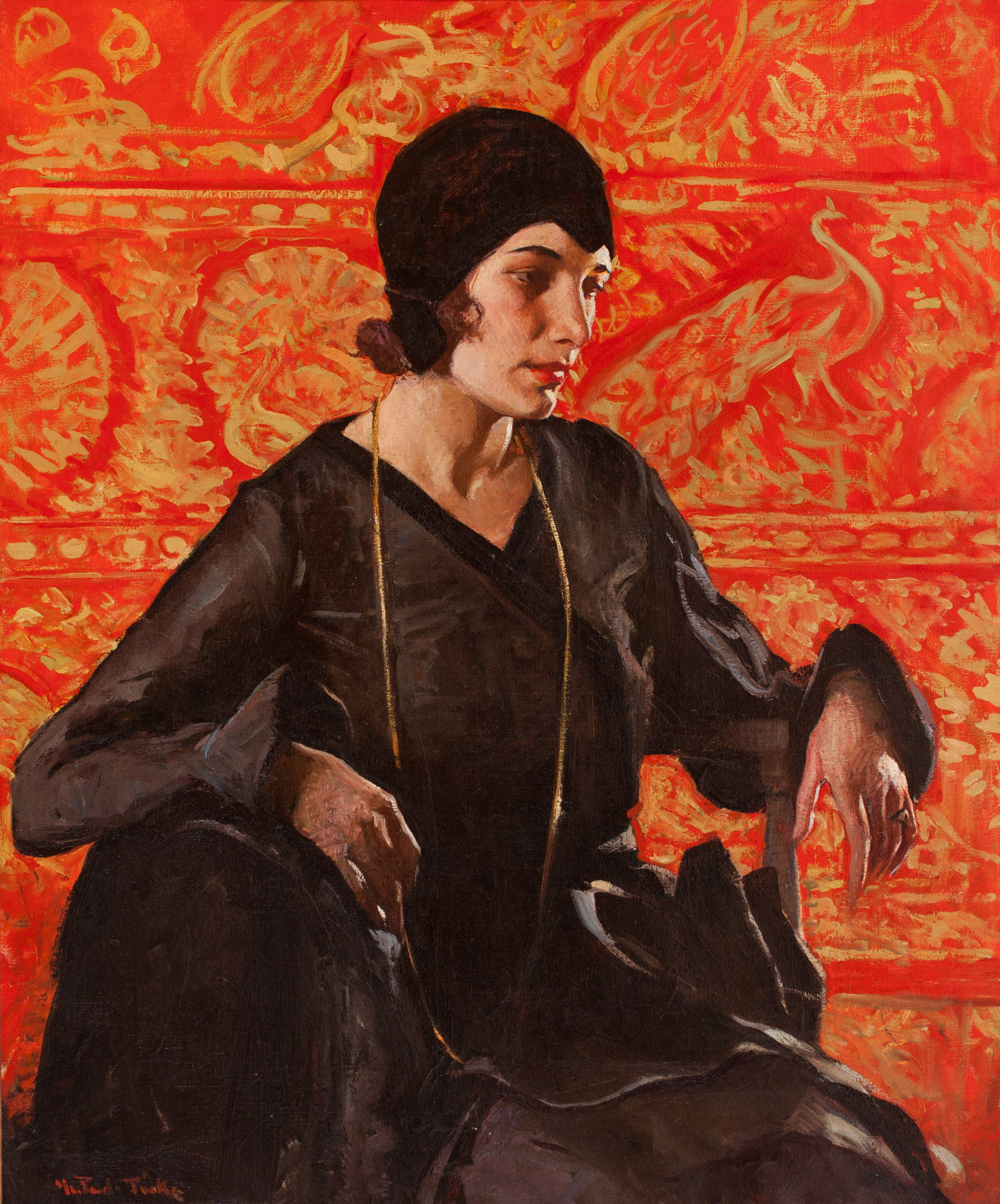
Although, my prime focus is usually the plein air landscape, I wanted to share the above portraits for no other reason than they are simply stunning. At the top we have 'Zinnias,' circa 1920. Oil on canvas. Mr and Mrs Richard Thune, and below that 'Bettina,' c. 1925, oil on canvas. Private Collection. Left: 'Woman with Flowers,' ca. 1922, oil on canvas, 30 x 36 in. Right: 'Strollers,' 1926, oc, 36 x 40, Jay Willis. All photos by Jeremy Fogg
I don't think anyone would guess Fiske was a 'Boston School' painter per se. Her seven years at the school studying with Edmund Tarbell, Frank Benson and Philip Hale obviously gave her the best art training one could hope for, but in looking at the texture and color her brushwork, as well as her innovative sense of design, the influence of her plein air teacher, Charles Woodbury, is more than evident in all her choices.
If you aren't able to visit the exhibition is person, and it's worth making the effort - admission is free, although a $5 donation is requested - then at least indulge yourselves in acquiring a copy of the exhibition catalog 'Gertrude Fiske: American Master.'
"The combination of Fiske's originality and selective eye, as well as her broad brush manner and audacious color, helped her become one of America's most individualistic painters, and raised the bar in the genre of American Impressionism." — Judith A. Curtis
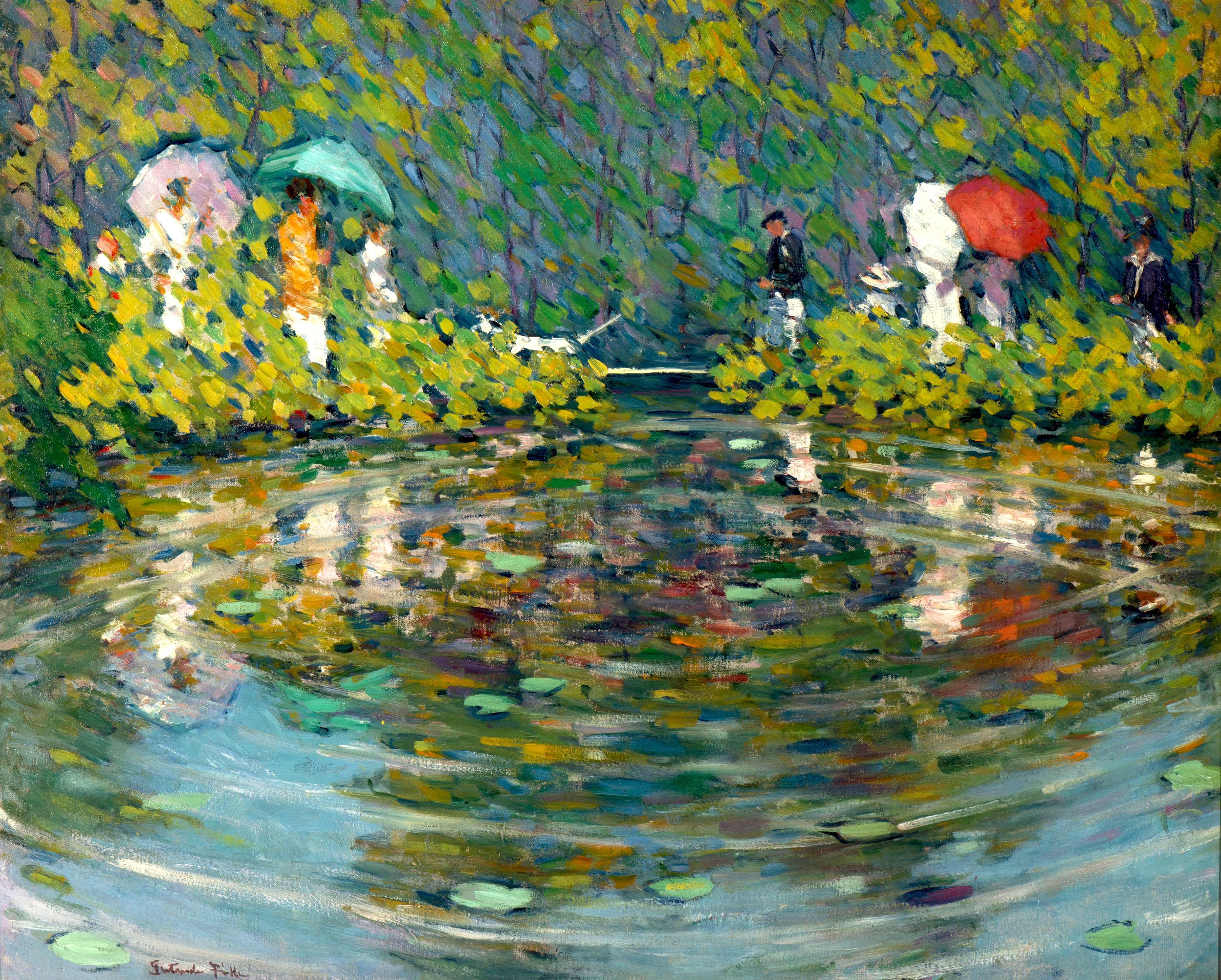
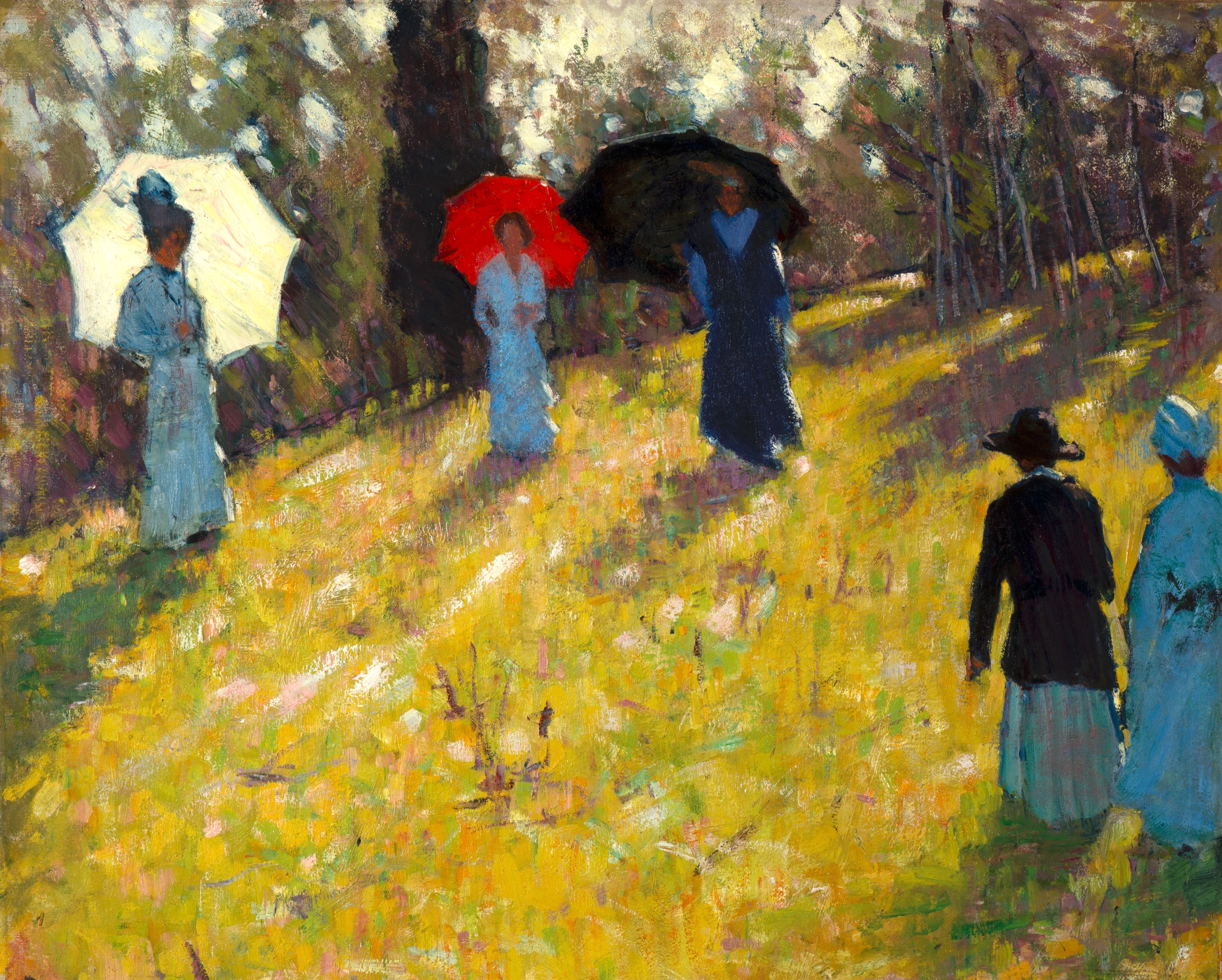
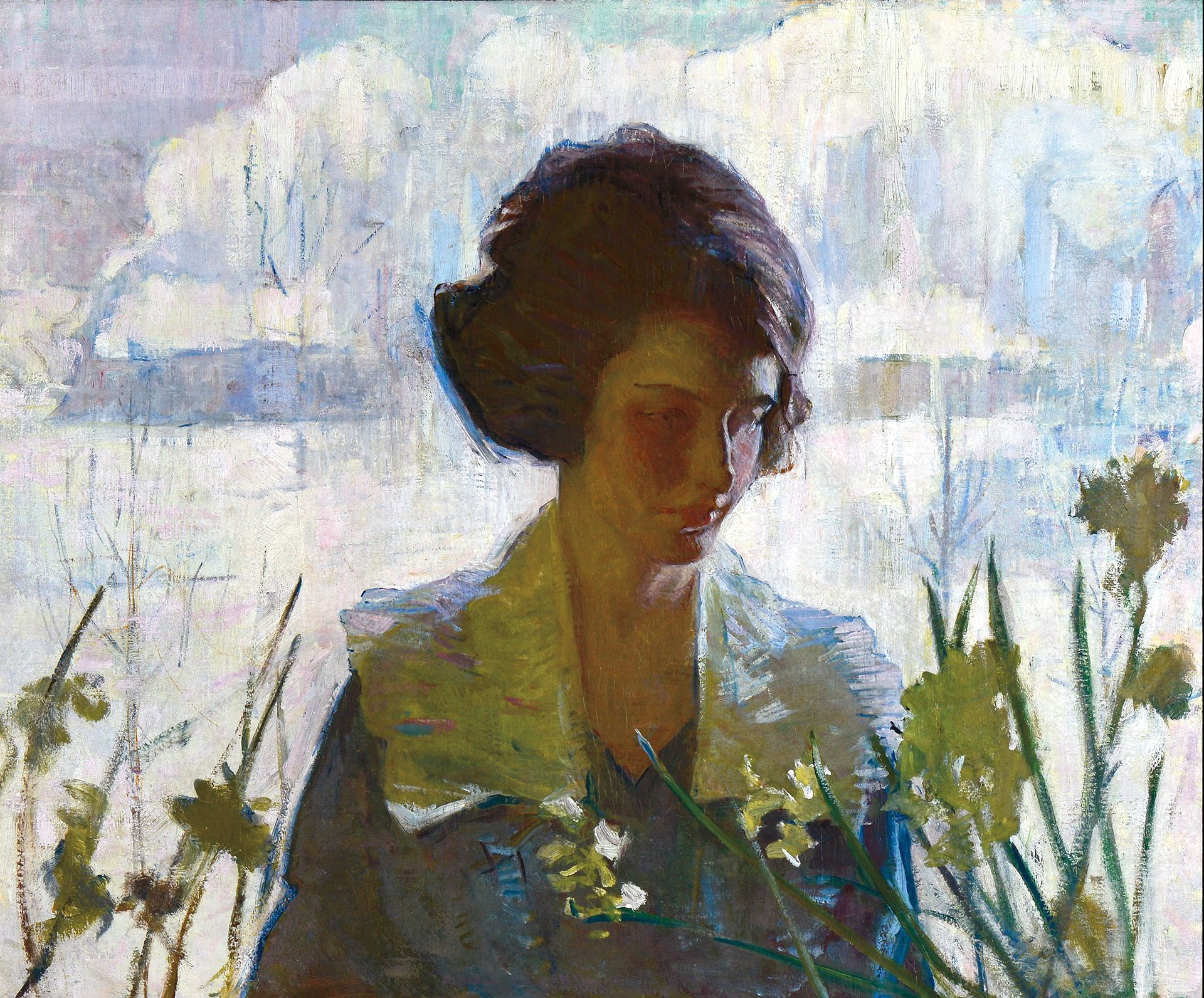
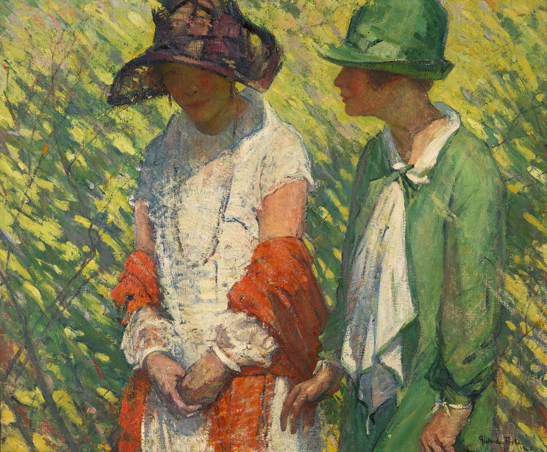
Above: left to right: 'Wells, Me.,' ca. 1920, oil on canvas, 20 x 27, private collection, 'By the Pond,' ca. 1916, oil on canvas, 29 1/2 x 36, private collection,' Sunday Woods' (also known as 'Women with Parasols,' 1925, oil on canvas, 24 x 30, private collection.
“Look continuously at the whole picture, not at parts, and roam from place to place making adjustments. That’s what painting is — making adjustments. Don’t look at one part too long or you will paint it too much in detail. The unimportant parts of a picture should not be minutely described so that they will attract notice. Do the values and let it go. Everyone …tries to get an effect by carefully describing an object. That's not the way it's done. Go back again and again …to the effect of things when you are looking at the whole picture. Anything is important which increases the effect of light and shade."
— Frank Benson
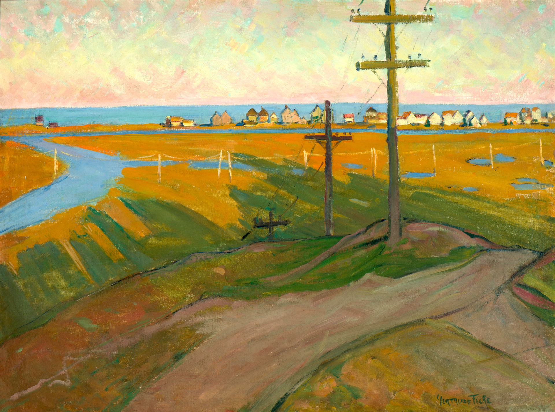
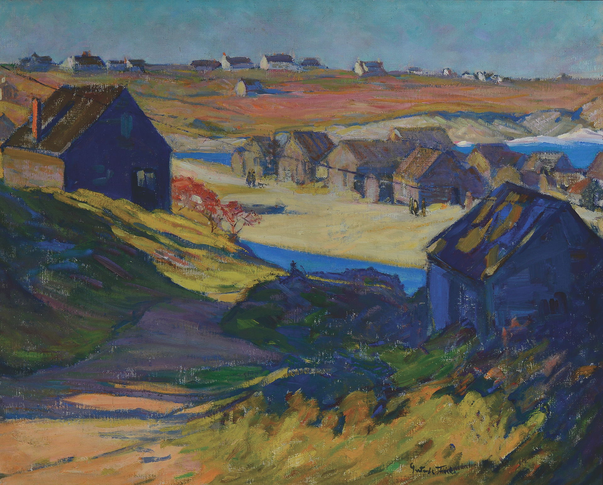
While Fiske obviously took Benson's advice to heart, we perhaps see more of the Woodbury character in the bold palette and loose brushwork in these paintings. Not that there is anything wrong with that. Artists who succeed generally take the knowledge they receive from each teacher and then apply it to their own personal vision to come up with a personal style. "Paint with Verbs - not nouns!" was Woodbury's credo, and Fiske certainly knew how to achieve that. Fiske's landscape paintings, often sketched en plein air, display a keen eye for nature, light and atmosphere. 'Wells Beach, Maine' is a wonderful example, with her vibrant palette which she combines with sweeping brushwork and a keen sense of color placement. It is said that as a young woman in the changing time of the early 'twenties, Fiske was keen to show the effects of progress in her work. However, we can also see how she uses the utility poles as counterpoints to direct the eye from foreground to middle ground to the line of white notes striding across the marsh, left to right, and thus to the line of houses on the edge of the coast. A wonderful sense of design. 'By the Pond' and 'Sunday Woods' also demonstrate Fiske's superlative sense of color when painting both front and back light. The reflections in 'By the Pond,' and the sense of movement she creates with a few subtle curvilinear brushstrokes, are as good, if not better, than many of her instructors.
“Who told you that one paints with colors? One makes use of colors, but one paints with emotions.”
— Jean-Baptiste-Simeon Chardin
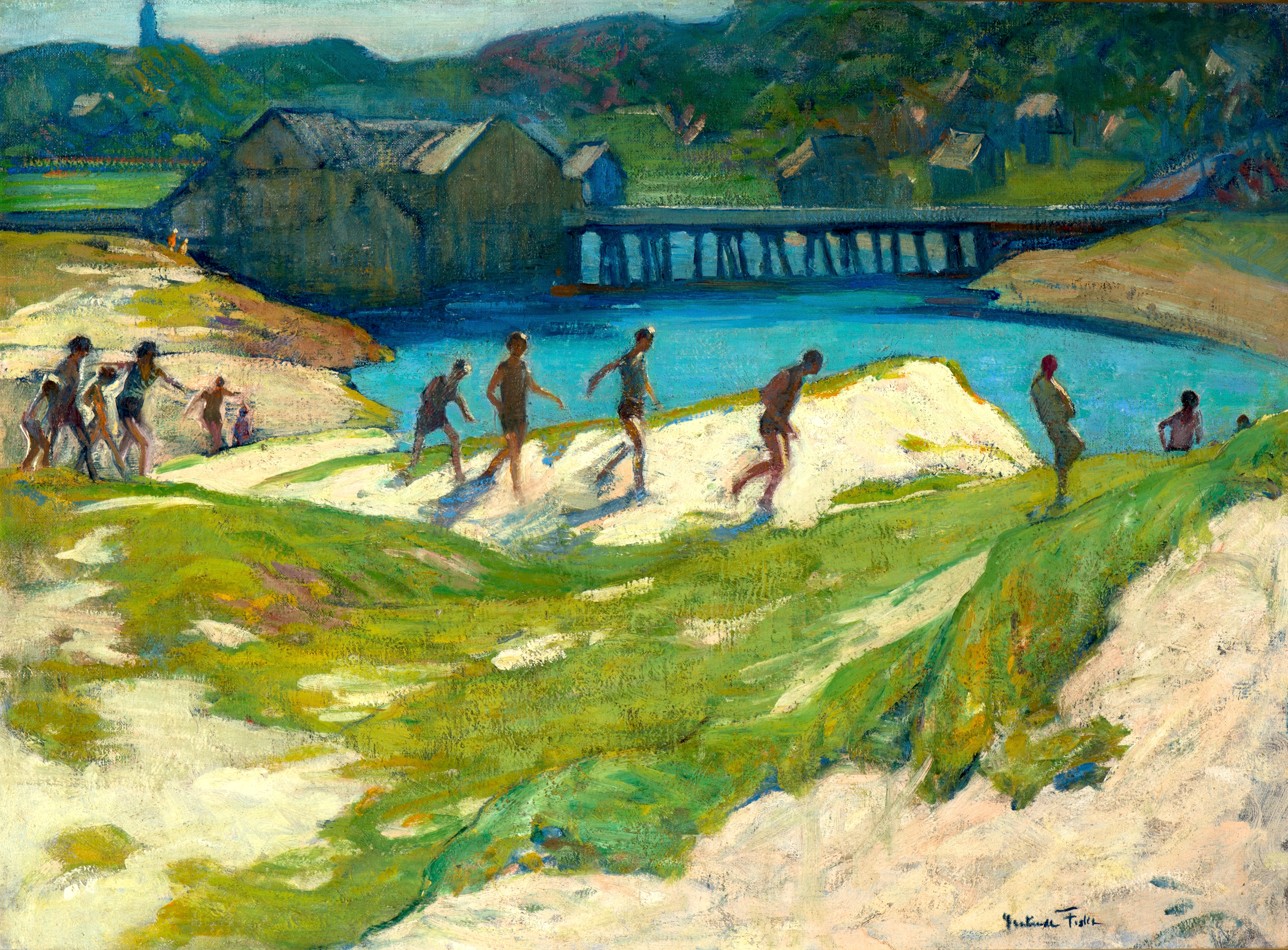
Left: 'Thunder,' ca. 1920, oc, 20 x 27, pc. Yet another inspired design by Fiske. And a great example of painting in verbs – not nouns! The hurried exodus of youngsters, and maybe one or two oldsters, as the first rumble of thunder approaches. The lack of sky at the top of the canvas focuses the eye on the causeway and adjacent buildings, which are subdued in darker muted tones to convey atmosphere and distance, while the lighter notes of the dunes brings the eye forward. In fact, the composition is almost cut in half, with all the interest in the top half, but the subtle handling of the foreground grassy notes contrasted with the warm tones of the sand dunes make large masses of negative shapes to balance the activity in the background.
"Objective painting is not good painting unless it is good in the abstract sense. A hill or tree cannot make a good painting just because it is a hill or tree. It is lines and colors put together so that they may say something."
— Georgia O'Keeffe
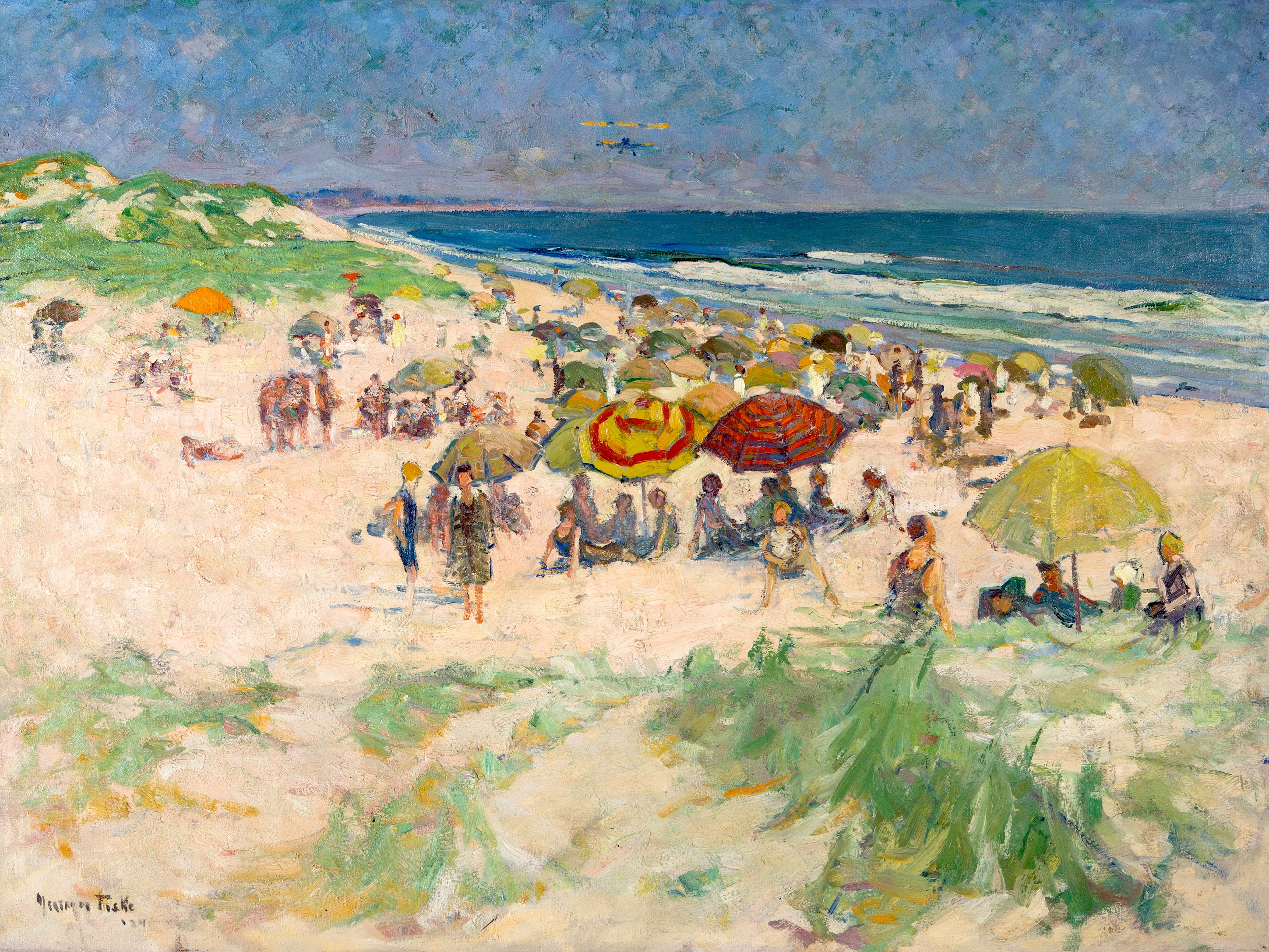
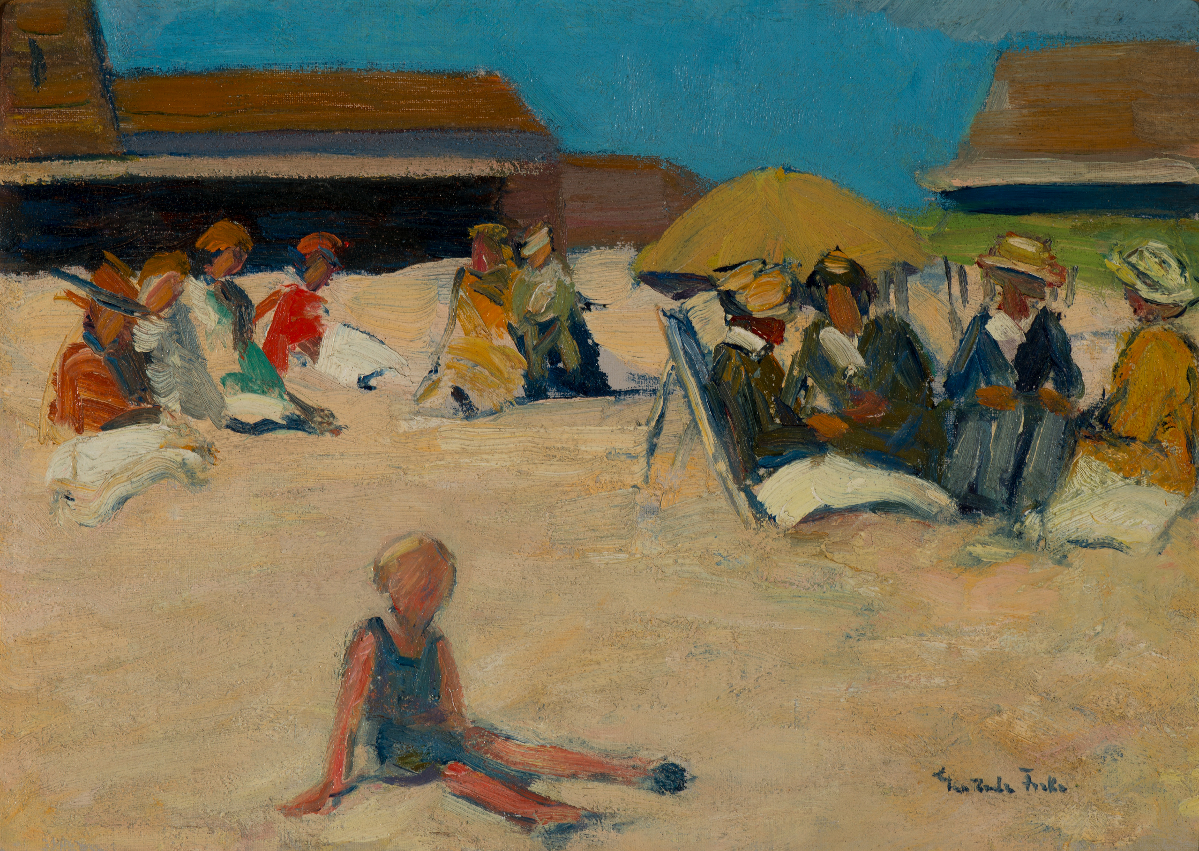
Middle: 'Ogunquit Beach,' 1924, oc, 40 x 50, Jay Willis. Interestingly, if we apply diagonal lines to this painting, we find the red and yellow beach umbrella almost dead center, a perfect bullseye, but Fiske gets away with this by placing the maker note of the blue and red umbrella right next to it, to draw your eye away and toward the third umbrella - you always need a third note to stop the eye playing ping pong between even numbers! Every person is placed on the beach in their appropriate place and no doubt Fiske used her artistic license to make sure her composition was harmonious and well balanced, even with the biplane approaching in the center of the sky - another touch of the progressive women - not a brush stroke is wasted or added for no reason. Apart from being a contemporary young woman, Fiske needed the biplane as the odd note in an otherwise empty sky!
Right: The Cove – Morning, 1925. Oil on canvas; 17 x 21 ¼ pc You can tell when a painting has been done outdoors, on the spot, because of the shadows. Landscapes done in the studio tend to have dark shadows because of the lighting, whereas something painted en plein air will have shadows you can actually look into. Not to mention other telltale signs like granules of sand various bugs embedded in the paint, or tiny indentations where either of the former has been flicked off once the paint dried.
“It is not by his mixing and choosing, but by the shapes of his colors, and the combination of those shapes, that we recognize the colorist. Color becomes significant only when it becomes form."
— Clive Bell
Left to right:
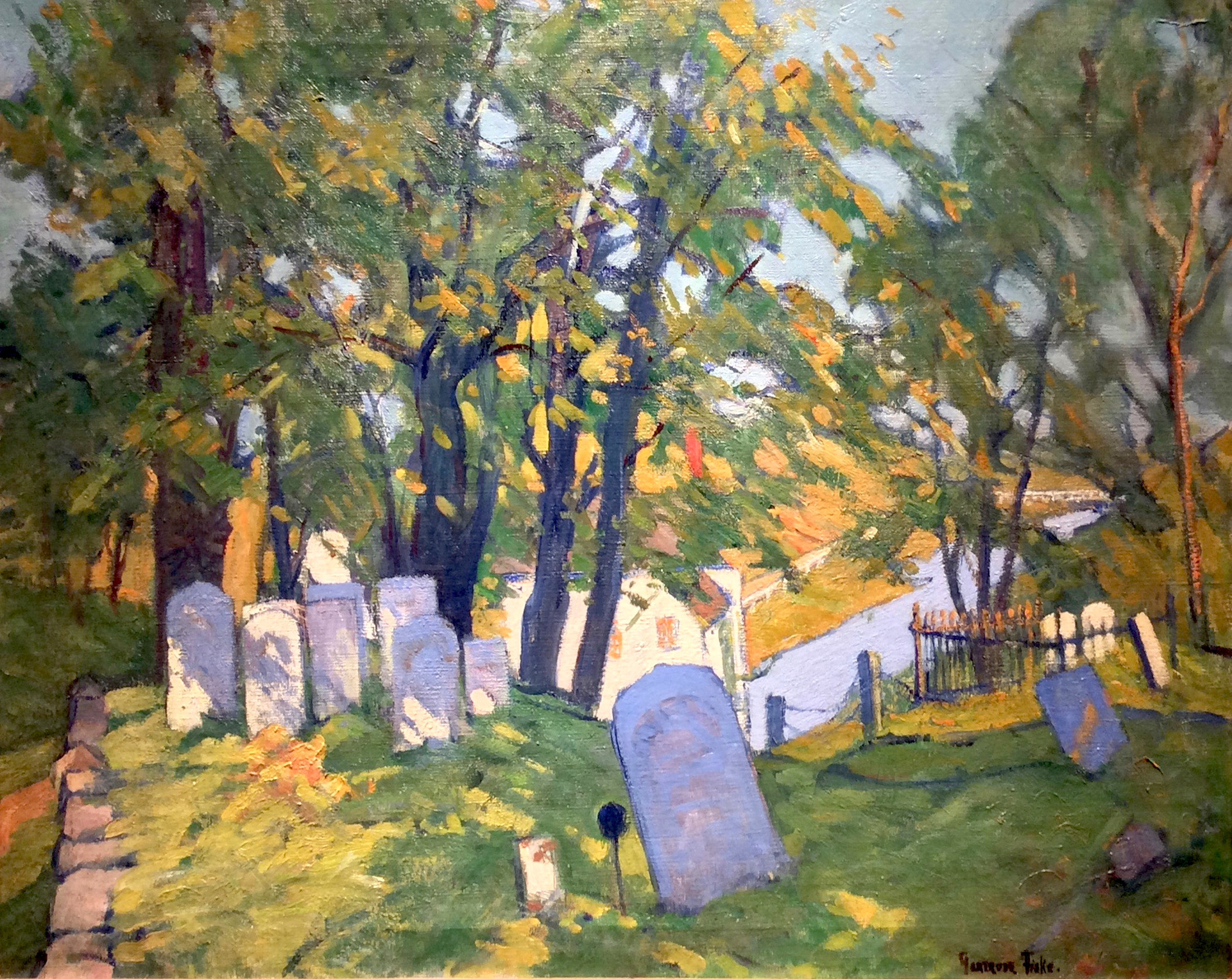
'Cape Neddick Graveyard,' ca. 1935, oil in canvas, 24 x 30, Ogunquit Museum of American Art; Gift of Artemis P. Willis (2002.4). A superb example of Gertrude Fiske’s plein air work, from that simple color spot of red in the distance - the odd note to counteract all the green - and the flat note of the sky to create a picture plane contrasting and complimenting the sun dappled foreground. It is rare to come across a perfect painting – but I think this is close; especially in the way the artist leads the viewers eye throughout the design.
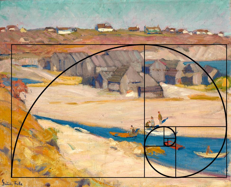
The Cove – Morning, 1925, oc 17 x 21 ¼, private collection. See how perfectly the nautilus shape fits Fiske’s design. Her flawless placement of the red note/boat is in the optimum spot to create a focal point within her painting. This is not just a pleasing pictorial coastal scene; it is a prime example of Fiske’s ability to ‘paint in verbs.’ The nautilus technique helps create movement and rhythm within the composition.That is not to say that Fiske deliberately creates this pictorial gesture on her canvas to begin with, but she has an innate sense of consummate design that helps her place elements within her composition in just the right place to carry the viewer's eye throughout her design.
There's a common mathematical ratio found in nature that can be used to create pleasing, natural looking compositions in your design work. We call it the Golden Ratio, although it's also known as the Golden Mean, The Golden Section, or the Greek letter phi. The mathematical ideas the Fibonacci sequence leads to, such as the golden ratio, spirals and self- similar curves, have long been appreciated for their charm and beauty, but no one can really explain why they are echoed so clearly in the world of art and nature.
“To see life directly and without preconceived ideas is the basis of individual expression. When a person has begun to look without fear and to make his personal choice, he is set in a direction to develop his full resources."
— CHW and EWP, The Art of Seeing, p. 12.
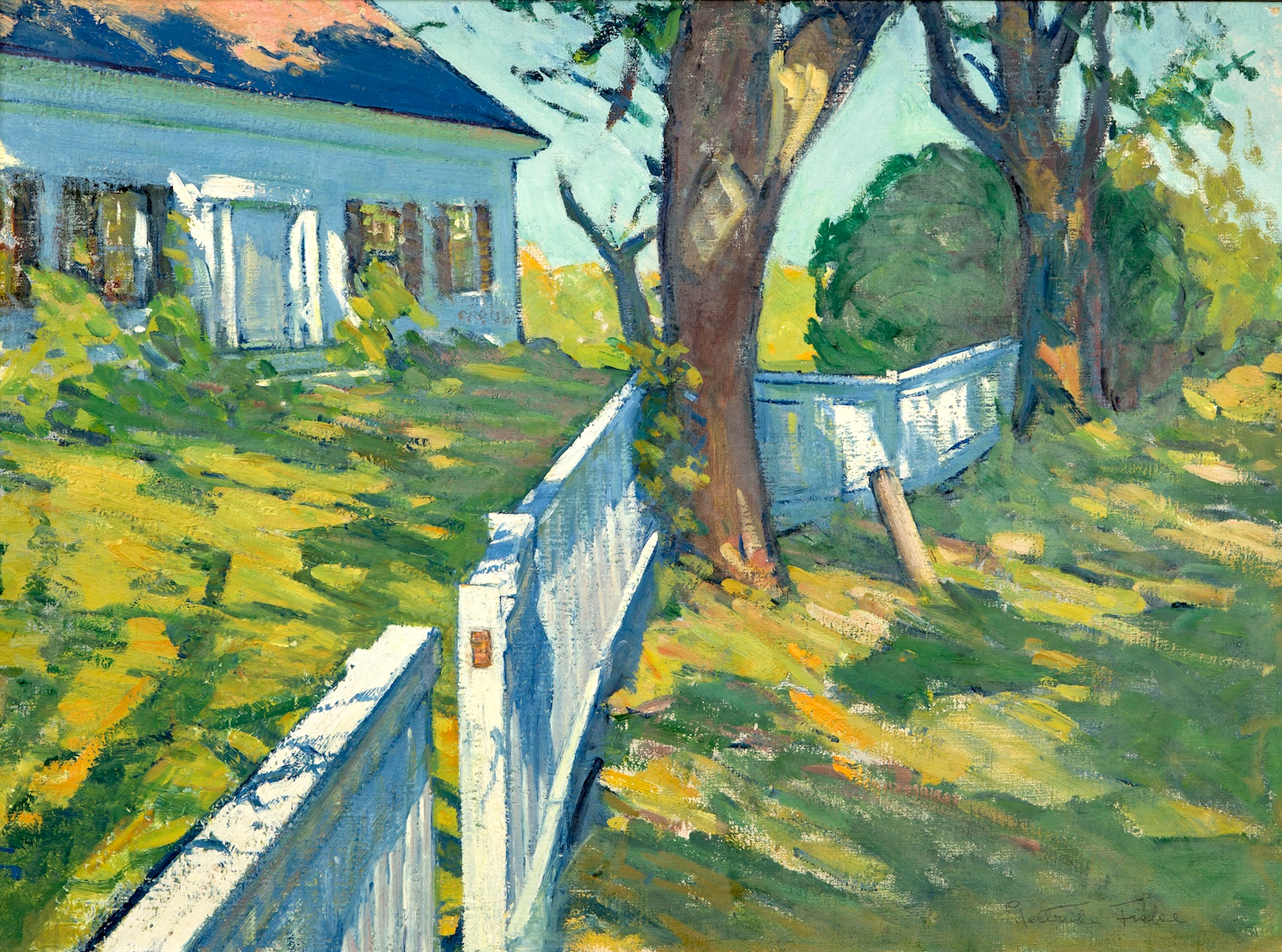
'On Pine Hill,' ca. 1920, oc, 26 x 33, Jay Willis. This was Gertrude Fiske's home on Pine Hill, Ogunquit, Me. Note how the artist has carefully put the lightest light brush stroke next to the darkest dark on the roof of the cottage to balance the composition and how she needed that odd note in the break of the fence to relate the foreground to the trees and sun dapple on the roof."You put a blob of yellow here, and another at the further edge of the canvas: straight away a rapport is established between them. Colour acts in the way that music does...."
— George Braque
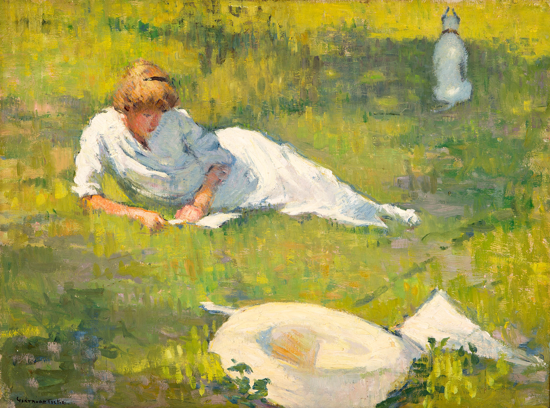
Dorcas Reading with Dog, ca. 1925, oc, 18 x 24, Jay Willis. Another striking design with the three light notes leading the eye from foreground to middle ground to the dog, Boy, in the background. And with his back to us; looking out of the painting! A very unusual device; you don’t usually want anything close to the edge of your canvas because it tends to lead the eye out of the painting, but because Fiske has surround the light note of Boy, with a larger, darker mass of negative space, the eye travels back to the foreground where it picks up the light not of the parasol next to the hat. And how neatly she has four objects in the painting, but makes the hat and parasol one conjoined note. She has now created three light notes – foreground, figure, and background – but the eye could also read it as one and three, Boy makes one note and the figure, hat and parasol make a foreground three.


Sisters of the Brush & Palette
Here we have Gertrude Fiske in correlation with three of her peers: Susan Ricker Knox, Anne W. Carleton and Margaret J. Patterson. All four of them learned from Charles Woodbury in Ogunquit, and yet managed to develop an individual style based on the same artistic principles.
"Whatever a painter may be, bright, stupid, or medium, his [or her] own personal view of things is the thing for him [or her] and for him [or her] alone. Thus in his teaching Mr. Woodbury tries to throw the whole question back to the personal efforts of each individual, and to train each pupil to know him [or her]self. This is a difficult thing to do, for very few people really know themselves, but it is the one thing to do and to hold on to — one’s own personality and the understanding of it."
— William Howe Downes, “The Ideas of a Marine Painter,” Art and Progress, vol. 4, no. 1 (November 1912): 764.
Just look how simply Fiske is able to suggest figures on the beach, despite the lack of features. These are the proverbial ‘mudheads’ beloved by Charles Hawthorne, the preeminent teacher down in Provincetown. Again, Fiske uses a very flat intense blue mass to suggest a hot summer sky, as well as deep shadows of the buildings in the background. All you can do is wonder at the women sitting on the beach behind the child, all bundled up for propriety’s sake. Heatstroke was obviously preferable to displaying a bare foot or naked ankle! Obviously executed alla prima, or what is called direct painting. Also known as 'all prima,' or all in one go, direct painting means putting down each stroke of paint on the canvas with the purpose of letting it stand in the composition as part of the final account. There is to be no retouching or overpainting after the first layer of paint has dried.
Middle left: Susan Ricker Knox, Ladd Doorway, ca. 1917, oil on canvas, 7 ¾ x 9 ¾. Collection of Douglas Nelson and Karin Cullity Nelson
Women artists were always willing to take risks with their art, especially through the strong use of color, broken color and impasto, perhaps because it was always a struggle to be treated equally with the men, they felt they had nothing to lose and everything to gain, by trying something different.
“Colouring does not depend on where the colours are put, but on where the lights and darks are put, and all depends on form and outline, on where that is put.”
— William Blake
Middle right: Anne W. Carleton, Beach Figures, aka Hot Sand, 1930s, Oil on academy board, 8 x 10. Collection of Darin R. Leese and Frank E. Vandervort.
"Carleton admired her close friend, Charles H. Woodbury, as a painter, teacher, and as an artistic inspirer. In Woodbury's Color and Emotions course in Ogunquit, Maine, Carleton learned to control linear dimension. She felt what she painted, and Woodbury encouraged her to paint vivid freely expressed canvases of people doing things in a landscape or seascape environment. Anne Carleton's palette and style often resembles Charles Woodbury's after 1928. Each artist used broad sweeping brush strokes to indicate movement and to show angular depth perspectives, crashing waves, or expansive sky views. Their sureness and accurate draftsmanship allowed a minimum of brush strokes to show the mood, the time of day, and the portrait of a place." — Anne Carleton (1878-1968) by Patricia Jobe Pierce [http://www.tfaoi.com/aa/2aa/2aa598.htm <6/29/2018>]
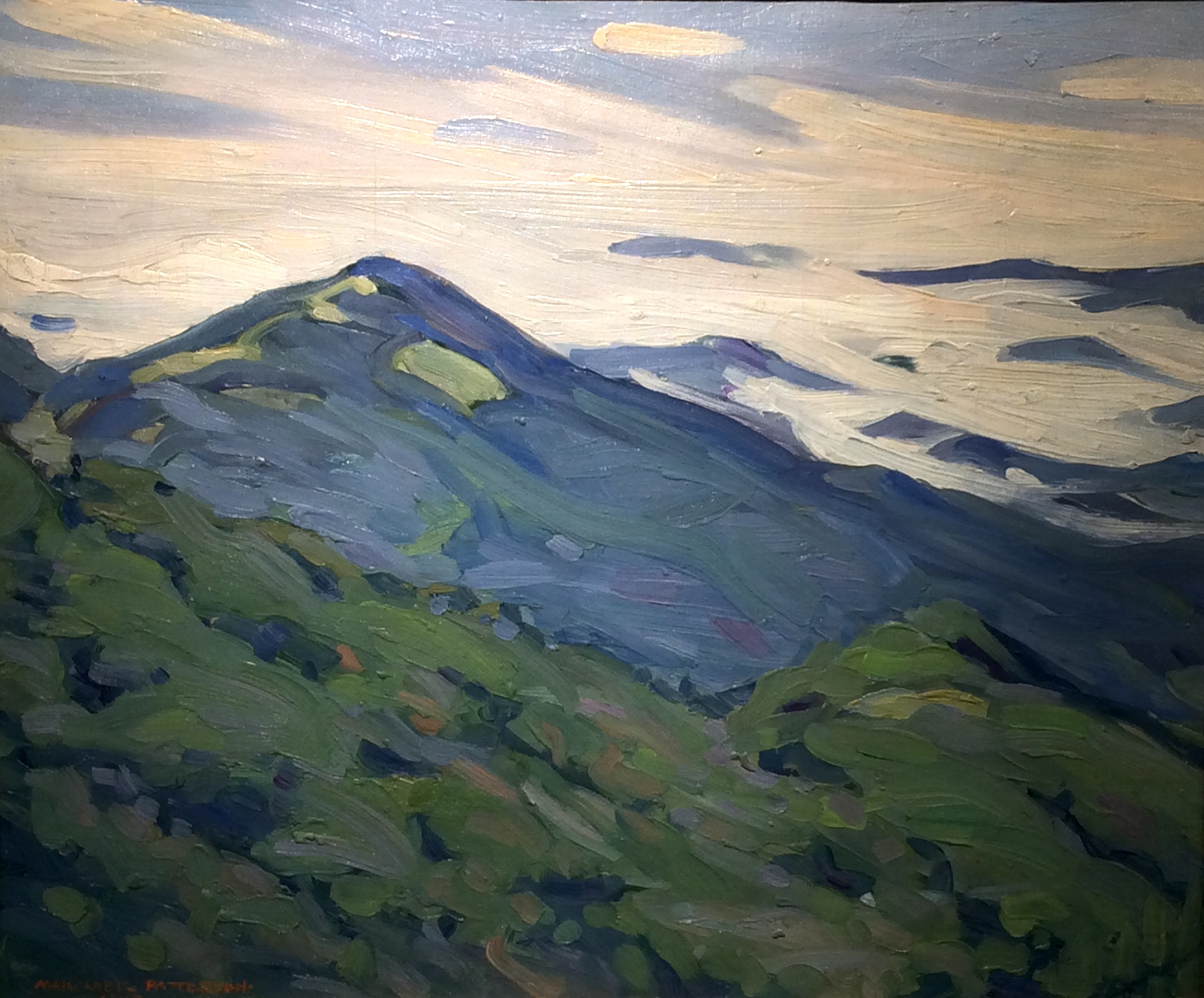
Far Right: Margaret Jordan Patterson (1867-1950) Mt. Kearsage
Another contemporary of Fiske’s, Margaret Patterson was born in Java, to ship captain's family based in Saco, Me. Throughout her career, Patterson covered the gamut of the art world working as a painter, printmaker, illustrator and art teacher. She loved to travel and her work displays a similar flair to Gertrude Fiske with her choice of unusual perspectives. We can also discern the influence of Arthur Wesley Dow, with whom she also studied, in the big flat shapes reminiscent of Japanese woodblock design.
“Art lies in the fine choice. The artist does not teach us to see facts: he teaches us to feel harmonies.”
— Arthur Wesley Dow
And one last thought:
How interesting to note that many women artists preferred to remain single in order to concentrate on their careers. A few married - including Polly Thayer Starr, Lillian Westcott Hale, and Jane Peterson - and were fortunate to have husbands who encouraged their work. Others were not so fortunate.
In 1884, artist Rhoda Carlton Holmes married Burr Nicholls, an American artist whom she met during a visit to Venice. For a number of years she managed to juggle her career with family life, including two children, but eventually the tension of opposites - domesticity versus painting - became too much to bear. The day came when one of the pair had a painting selected for the Paris Salon while the other did not. If it had been the husband's work that was preferred, the wife would have been expected to accept it and move on. However, this was not the case; it was Rhoda Holmes Nicholls' painting that was selected.
During the ensuing divorce, which because of their celebrity was well publicized, everyone felt qualified to give an opinion including the press when “newspapers widely warned women about the dangers of success and its potential influence on marital and domestic bliss.” Thank Heaven we have moved on to a more solicitous society. We have moved on, haven't we?